URL: https://theidleman.com/blogs/news/how-to-wear-a-snapback
Browser / Version: Firefox Mobile 66.0
Operating System: Android 7.0
Tested Another Browser: Yes
Problem type: Design is broken
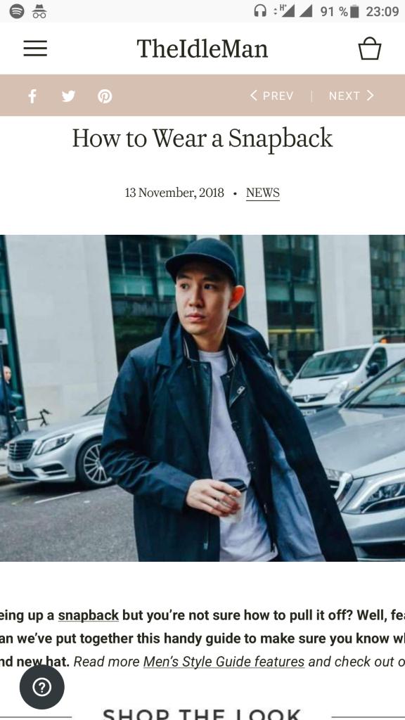
Description: content is displayed in a div to wide for viewport (responsive design fails in Firefox, works in Chrome)
Steps to Reproduce:
Surfing the site in Chrome, the responsive design works as expected (no x-axis scroll)
surfing it in Firefox text ends up left off the screen and also right. you can only scroll to the right text, the left is impossible to read. (unless I switch to a desktop user-agent)
I attached a screenshot of Firefox

Browser Configuration
From webcompat.com with ❤️
URL: https://theidleman.com/blogs/news/how-to-wear-a-snapback
Browser / Version: Firefox Mobile 66.0
Operating System: Android 7.0
Tested Another Browser: Yes
Problem type: Design is broken
Description: content is displayed in a div to wide for viewport (responsive design fails in Firefox, works in Chrome)
Steps to Reproduce:
Surfing the site in Chrome, the responsive design works as expected (no x-axis scroll)
surfing it in Firefox text ends up left off the screen and also right. you can only scroll to the right text, the left is impossible to read. (unless I switch to a desktop user-agent)
I attached a screenshot of Firefox

Browser Configuration
From webcompat.com with ❤️